Followers drift, but email subscribers choose to let you in. And what do most brands do with that privilege?
They yell, and they abuse the poor exclamation mark.
‘FINAL CHANCE TO BUY!!!!!!’
Which is a shame, really, because with email, for every $1 spent, ecommerce brands get $45 back.
“Statistically, it’s better to trade 1,000 new followers for a single email subscriber, ” says Rand Fishkin, founder of the market research company, SparkToro.
Email is owned: it’s yours, it’s direct, and it's probably the one marketing channel that doesn’t change with every algorithm update. So why do so many ecommerce brands get it spectacularly wrong?
Below you’ll find seven email marketing mistakes that tank performance—and what to do instead—with advice from real experts.
The top 8 email marketing mistakes ecommerce brands make
According to Klaviyo, campaign emails see average open rates around 37.9% and conversion rates of just 0.09%.
So we know the channel works, but most brands are stuck doing the same things that drag those numbers down. Here's what's going wrong (and how to get it right):
Email marketing mistake #1: Going too hard (or too soft) on promotion
Kellon Ambrose, Managing Director at Electric Wheelchairs USA, learned this lesson the expensive way.
"I continue to stand by a non-promotional approach in any email newsletter campaign," he says. "However, I learned being too non-promotional is just as counterproductive as being too promotional. My philosophy is to find a balance."
Most email marketers are either running a 24/7 flash sale or pretending they don't sell anything at all. Both approaches tank your revenue, just in different ways.
The hard-sell crowd treats every email like a clearance event. Subject lines scream ‘LAST CHANCE!’ and ‘FINAL HOURS!’ even though there's another sale starting tomorrow.
In fact, 44% of people cite ‘excessive emailing frequency’ as the top reason for unsubscribing.
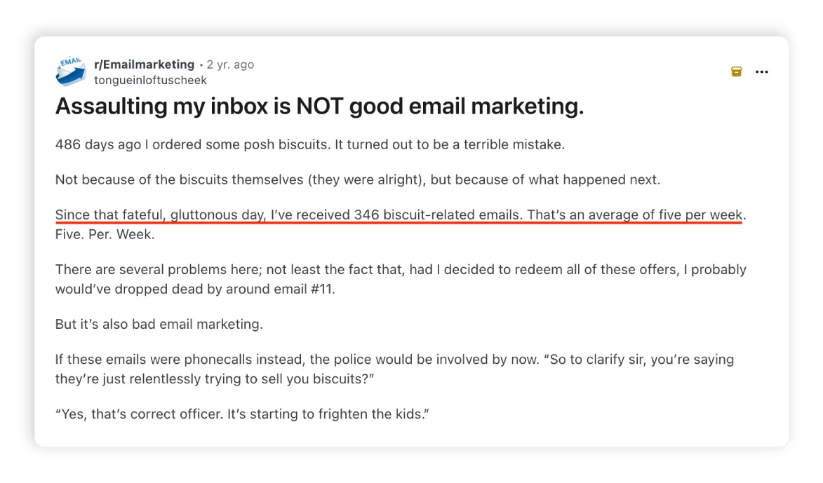
Or take this gem from Reddit. One user shared their tale of biscuit-based email regret:
“486 days ago I ordered some posh biscuits. Since that fateful, gluttonous day, I’ve received 346 biscuit-related emails. That’s an average of five per week. If these emails were phone calls instead, the police would be involved by now.”
Then there's the soft-sell camp, so worried about seeming pushy that they forget to mention they actually sell things. They send gorgeous newsletters full of tips, stories, and helpful resources.
But nobody's buying, because nobody's being asked to buy.
The average email conversion rate across industries sits around 1%-3%, but emails without clear calls-to-action (CTA) convert at virtually nothing.
Back to Kellon. His team went all-in on authority-building content: educational, informative, and helpful. But only about one in four emails had a CTA, and the rest just linked to blog posts or FAQ pages.
The strategy worked for building the list and boosting opens, but subscribers would disappear mid-funnel.
So they made one simple change: every newsletter now included a CTA, but the sales pitch lived in the closing statement only; and within 120 days, all their ROI metrics jumped 14%.
What to do instead:
1. Lead with value, close with a clear ask.
Give people something useful first, like an answer to a question or a solution to a problem. Ultimately, you want to share something that they actually want to read.
Then, at the end, tell them what to do next. ‘If you want to take this further, here's how we can help.’
2. The 80/20 split works for most brands: 80% value, 20% ask.
Your email should feel helpful first, promotional second. Think of it like a conversation where you offer advice and then mention, ‘Oh, and if you need this, I've got it.’
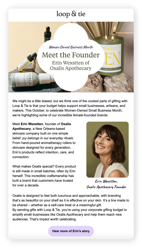
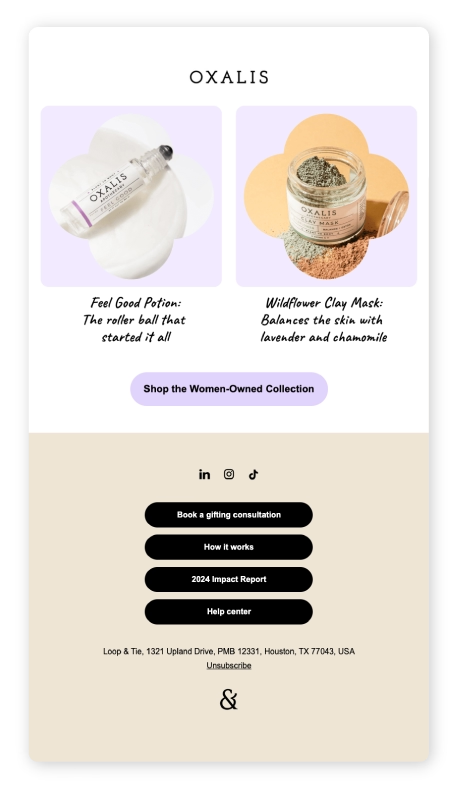
👉Real-life example: Take a look at how Loop & Tie nails the balance. They lead with a founder story about women-owned businesses and small-batch craftsmanship, then close with "Shop the Women-Owned Collection."
You learn something meaningful, and if you're interested, you know exactly what to do next.
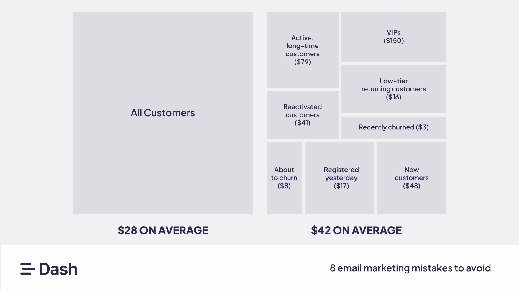
Email marketing mistake #2: Overcomplicating (or ignoring) segmentation
Even basic segmentation drives more revenue. One study found that segmented campaigns earn 50% more per customer than campaigns that treat everyone the same.
So why do so many brands still get this wrong?
The lazy approach treats your entire list like one person: new subscribers get the same email as your most loyal customers; and someone who bought once in 2019 gets treated the same as someone who orders every month.
Then there's the other extreme: brands with 47 segments based on every variable imaginable: ‘Women aged 25-34 in California who clicked on a product link on a Tuesday, opened three emails in the past month, but haven't purchased in exactly 47 days.’
Leah Miller, Marketing Strategist at Versys Media, sees both mistakes constantly: "One thing I've seen ecommerce brands consistently miss with email is proper segmentation," she says.
"They either over-generalize with broad campaigns or go too granular and end up creating 20+ segments with no real strategy behind them."
Leah’s team had inherited a mess: overly complex segments, inconsistent logic, and no real lifecycle thinking.
They simplified their client’s segmentation into four core customer personas based on buying behaviour, average order value, and product category affinity. Then they built automated flows around lifecycle stages rather than demographics.
And what do you know, within eight weeks, their average open rate jumped from 17% to 28%, and revenue attributed to email grew by 60%.
What to do instead:
1. Start with behaviour, not demographics.
Oftentimes, what someone does matters more than who they are.
Did they buy it once or 10 times? Do they open every email or ignore most? Abandoned cart or just browsing? Actions reveal intent that demographics often don't.
2. Stick to 3-5 segments maximum.
Most brands can win with just these: new subscribers, one-time buyers, repeat customers, VIPs, and inactive subscribers.
Each group needs different messaging because they're at different stages. If you need more than five segments, you're probably overthinking it.
3. Match content to stage.
Don’t blast the same sale to a curious newbie and a loyalist who’s bought five times.
The new shopper might need hand-holding, while the loyal one wants early access, perks, and insider treatment.
👉Real-life example: Look at how Kleo handled their product launch. Instead of sending their entire list with ‘New product available now!’, they sent a pre-launch email to their most engaged subscribers with a specific offer: reply ‘I'm in’ to secure one of 500 early access spots at $59/month (versus $99/month for everyone else).
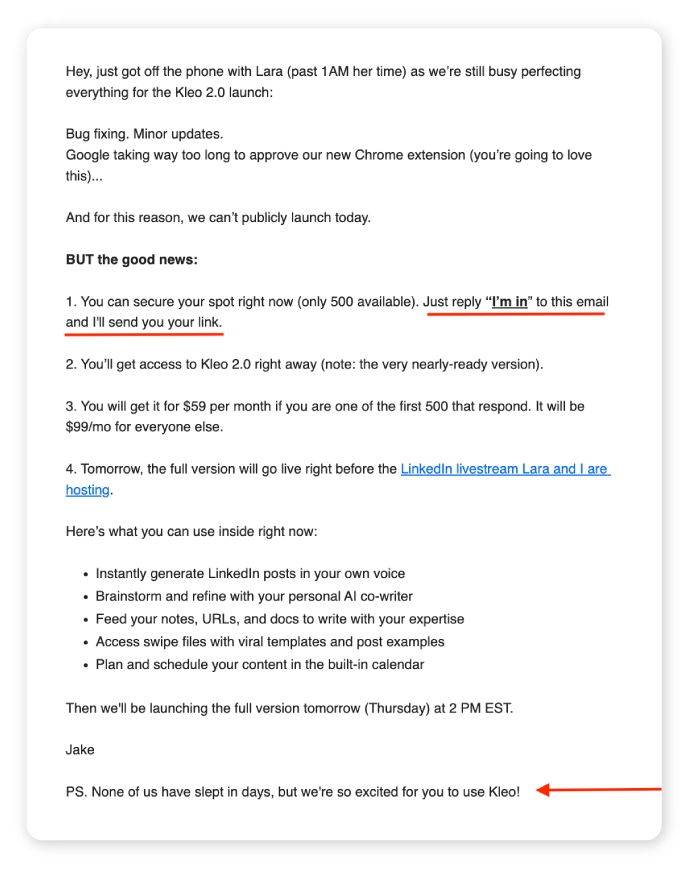
The people who reply immediately become their VIP early adopters segment and get rewarded with better pricing and immediate access. Everyone else waits for the public launch the next day at full price.
Email marketing mistake #3: Keeping dead subscribers on your list
Not every subscriber is worth saving. We know, seeing that email list shrink is painful. But keeping ‘ghost’ subscribers around just for vanity metrics is costing you far more than it’s helping.
Ashot Nanayan, Head of Marketing and Founder of DWI, says that they worked with a B2C electronics client that had a dormant email list for years.
“We re-engaged them with a ‘we miss you’ campaign and early access to a new product on special terms.”
And within a week, they achieved a 27% open rate, 12% click-through rate, and generated over $18,000 in sales from leads who had not reached out to the brand in more than 18 months.
Dead subscribers tell email service providers (ESPs) like Gmail and Outlook that nobody wants your emails, which pushes you straight into spam folders—even for people who actually want to hear from you.
- Across ESPs, the average deliverability rate is about 83.1%, meaning roughly 16.9% of emails never even reach an inbox.
- Google’s Email Sender Guidelines say senders should “keep spam rates reported in Postmaster Tools below 0.30%, and avoid ever reaching a spam rate of 0.30% or higher.”
What to do instead:
1. Define what ‘inactive’ means for your business.
For some brands, 90 days without engagement is the cutoff, while for others, it might be 180 days. If you send daily emails, your timeline is likely shorter; if you send monthly, it's longer.
Pick a timeframe that makes sense for your cadence and stick to it as much as possible.
2. Follow your customers’ ESPs guidelines closely.
As of 2024, Gmail and Yahoo enforce stricter rules for bulk senders. If you send 5,000+ messages/day to Gmail accounts, you must:
- Authenticate your emails with SPF, DKIM, and DMARC.
- Keep spam complaints under 0.3% via Postmaster Tools.
- Make unsubscribing easy—one-click unsubscribe required in the header.
- Process unsubscribe requests within 2 days.
- Use a consistent sending domain and IP.
💡Pro tip: If you’re not sure your email is authenticated, run your domain through Google Postmaster Tools or ask your ESP for help setting up SPF, DKIM, and DMARC.
3. Send a re-engagement campaign before you delete anyone.
Give people one last chance to opt back in. Send a ‘We miss you’ email with a clear subject line like ‘Should we break up?’ or ‘Still want to hear from us?’
Make it easy to stay subscribed with a single click, but don't beg. If they don't respond, they've given you their answer.
4. Scrub your list at least quarterly.
Set a recurring calendar reminder every 90 days to review inactive subscribers. Dead weight accumulates constantly—people change email addresses, lose interest, or forget they subscribed.
Regular pruning keeps your list healthy because a smaller, but engaged list will drive more revenue, cost less to maintain, and keep you out of spam folders.
Email marketing mistake #4: Not reading the room (or your automations)
Automated flows are every marketer’s best friend: they convert better than campaigns, and they run on autopilot; and Klaviyo says automated emails average 48.6% open rates and convert up to 1.7% of clicks.
But automation has—and needs—human limits.
“The timing of messages and customer behavior is an aspect that is not usually visible in ecommerce brands. Most people send their offer to all people and fail to consider that timing is the most important factor in conversion rather than the quantity,” says Steven Bahbah, Managing Director at Service First Plumbing.
Last year, one Redditor shared that during forest fire evacuations, when people were losing their homes and dealing with smoke warnings, Dyson sent promotional emails for air purifiers.
Another replied that after a tornado hit their county, contracting companies flooded their inbox the next day.
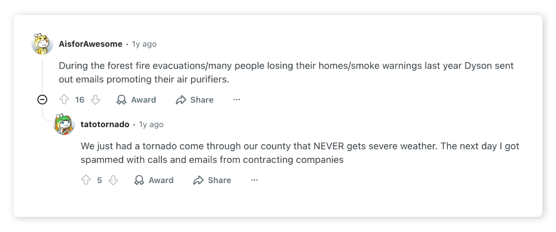
Both technically ‘relevant’ to what was happening, and both spectacularly tone-deaf.
Aside from crisis management, marketers often trip up in smaller, more common ways. Like sending birthday offers the day after someone unsubscribes, or running ‘spring refresh’ promotions during Ramadan or Passover when portions of their email list are observing something far more significant.
What to do instead:
1. Start by building pause conditions directly into your flows.
First, tackle the infrastructure. Start by creating a dynamic segment in Klaviyo, for example, called something like Crisis_Pause_List.
This segment should:
- Include affected zip codes, states, or countries when regional events hit (e.g., California wildfire zones, FEMA-declared areas).
- Be added as an exclusion condition to all key flows: welcome series, cart recovery, post-purchase, winback.
Now, the protocol. Assign a team member (or yourself) to review flows any time a crisis or sensitive news cycle breaks; think natural disasters, geopolitical unrest, mass layoffs.
Your checklist should include:
- Scanning headlines for top 10 subscriber regions.
- Reviewing subject lines + CTAs scheduled in the next 7 days.
- Asking yourself: ‘Would I send this to someone I know going through that event?’
If the answer is no, activate the crisis pause segment with one click and pull those subscribers out of every active automation.
2. Bake cultural and contextual sensitivity into seasonal flows.
Try using these filters to avoid an email faux-pas:
- Country-based segmentation: Create separate flow branches for the UK or US vs. other international subscribers. (Because a peppy ‘Happy 4th of July’ or ‘St. George's Day’ promotion might feel alienating in other markets.)
- Religious/cultural blackout dates: Build a shared marketing calendar with key observances across your top five geographies.
- Tone test: Ask ‘Would this copy feel appropriate if the reader was grieving, displaced, or financially stressed?’
3. Every Q1, audit your automations with fresh eyes.
Does your abandoned cart ‘last chance’ sound more like a threat than a nudge? Are your birthday offers still going to people who unsubscribed last week? Does your rainy-day promotion accidentally land during a flood alert?
Automations are living, breathing touchpoints; and if you’re not checking them regularly, they might embarrass your brand when the stakes are high.
Check that your seasonal campaigns respect local holidays and events.
Email marketing mistake #5: Treating emails like just words on a screen
You’ve got all the right ideas: a clever subject line, a strong offer, maybe even some solid segmentation. But when the email lands in your customer’s inbox…it looks like a wall of text.
Or worse, your ‘product image’ is a stretched screenshot from your website.
23% of emails are skimmed (2–8 seconds), and 15% are mere glances, which means you don’t have time for your message to warm up—you need to stop the scroll, fast.
👉Real-life example: Chewy does a fantastic stop of incorporating visuals into their email campaigns.
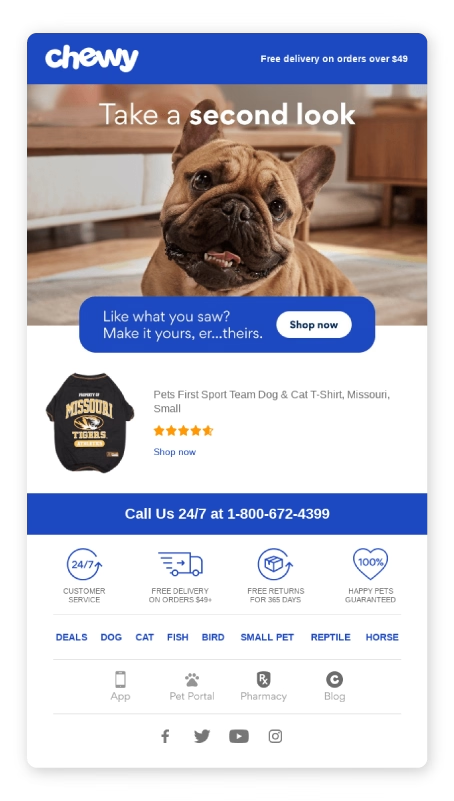
This email does three things incredibly well:
- Hooks you visually with an emotional, high-resolution image (hello, adorable bulldog).
- Delivers context fast with clear product imagery and social proof like star ratings.
- Uses visuals as CTA so the product image and button both invite the click.
But most teams still treat visuals as an afterthought, pulled from someone's ‘email_assets_final_v3’ Drive folder, resized manually, and uploaded into Klaviyo with zero context on what’s worked before.
What to do instead:
1. Treat your email like a mini landing page.
That means one strong headline, one compelling visual, and one clear action. Tools like BeeFree, Stripo, and even Klaviyo make it easy to build beautiful, visual-first layouts in minutes, even if you don’t have a designer on call.
2. A/B test your hero images just like you would subject lines.
You wouldn’t send the same subject line to every subscriber without testing, right? The same logic applies to visuals. Your hero image is the first thing people see when they open the email—it’s your chance to spark emotion, curiosity, or instant product desire.
Tools like Klaviyo, ConvertKit, and Mailchimp all support image-based split testing, so you can experiment with different product shots, backgrounds, or models to see what actually drives clicks.
3. Use a digital asset management (DAM) software like Dash.
Visuals move people, but if your image workflow is stuck in Google Drive hell, you’ll never get them to pull the click.
Here’s how Dash’s Klaviyo integration bridges that gap:
- Search Dash for your best-performing images (e.g. “blue paint can”).
- Crop or resize directly in Dash to match your email template.
- Embed the image via a URL in Klaviyo, no need to upload files or rename them.
- Access all “Dash-inserted” images later in Klaviyo, in your image library.
👉Real-life example: COAT, the luxury paint brand, uses Dash to spark better ideas, faster.
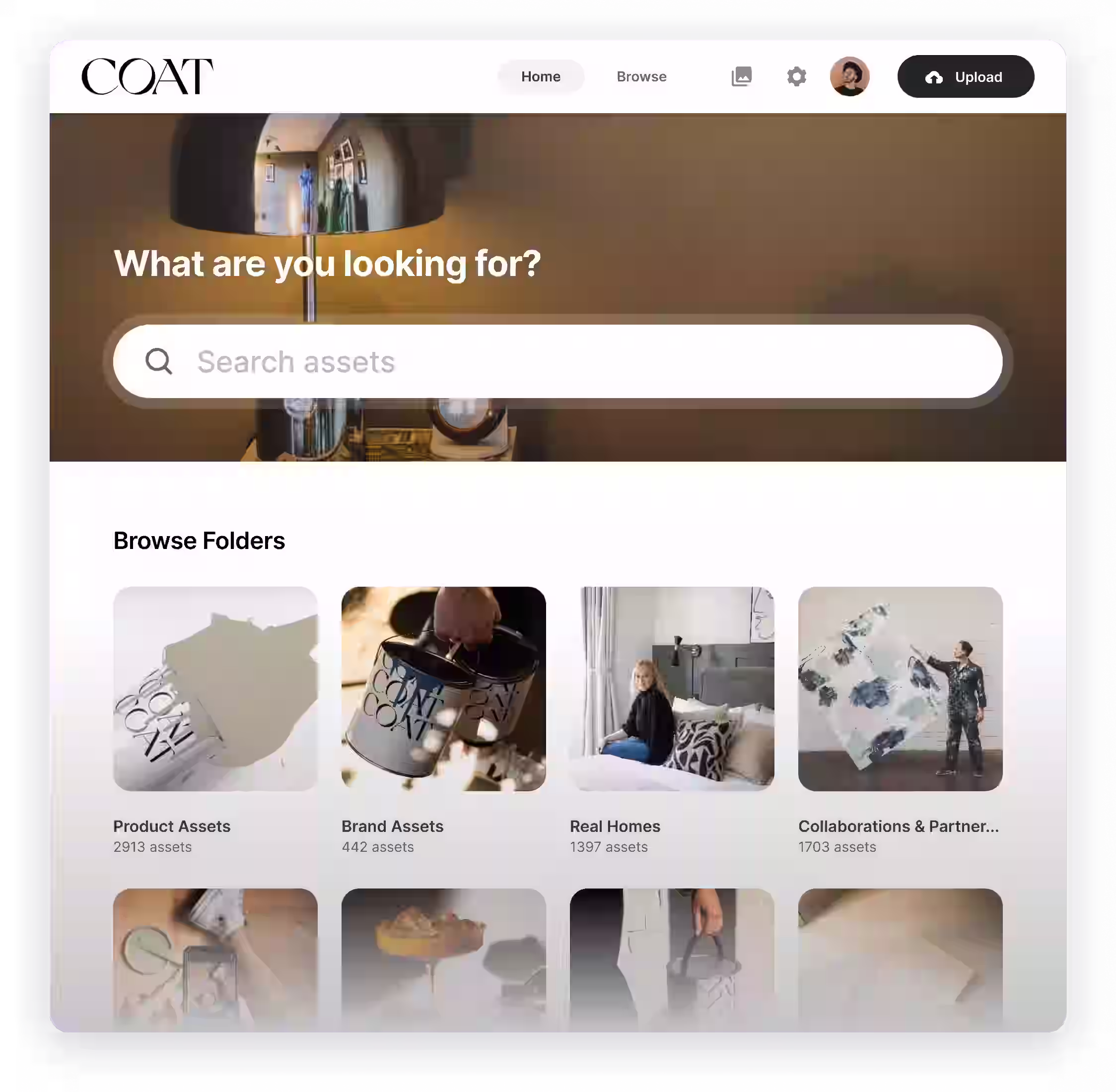
Abi, Brand Manager at COAT, says Dash has transformed their campaign planning:
“The searchability in Dash has been a game changer for us. It’s my favourite feature. It helps spark new ideas—especially since we have so much content, it’s easy to forget what’s available. Being able to dive into these little rabbit holes and discover things we didn’t even know we had is incredibly useful.”
Email marketing mistake #6: Optimizing blindly without proper attribution
Open rates feel good, and click rates look impressive on a dashboard. But neither tells you if your emails are actually making money.
The problem gets worse when you can't tell which emails are actually driving sales.
Amanda Shaftel, Co-Founder and CMO at Cowboy Pools, puts it bluntly: "Know the difference between influence and coincidence.”
She shares:
“Once, we thought our campaigns were overly successful because of our emails. After proper attribution, we noticed people were buying more because of the weather forecast, not our emails."
And this tracks. According to Superpath’s 2025 Content Attribution report, the majority of respondents (71%) said their attribution data is only “sort of accurate but not the full picture.”
Amanda’s team had been optimizing based on open and click rates for months instead of revenue and journey contribution. Campaigns would hit 50% open rates and they'd consider it a win, yet sales data stayed the same. Flows competed with each other—a cart recovery email and a broadcast sale email would reach the same person within hours.
They had no idea which one actually drove conversions, or if the emails even mattered at all.
They fixed it by setting up UTM tagging on every send tied to Google Analytics. Instead of obsessing over open rates, they started tracking revenue per recipient and also added time windows for exclusions to prevent overlapping sends.
And they went deep into the data: ad spend, temperature forecasts, click-through rates, shipping times—to isolate what actually caused conversions.
“It is impossible to optimize what you don’t understand.”
What to do instead:
1. Use UTM parameters to track attribution clearly.
UTMs help you trace every email click back to revenue in tools like GA4, Triple Whale, or Northbeam.
- Create naming conventions for campaigns, flows, and tests.
- Keep a UTM spreadsheet for consistency across platforms.
- Use tools like Google’s Campaign URL Builder or your ESP’s built-in UTM tools.
Example UTM structure:
utm_source=email
utm_medium=automation
utm_campaign=cart_recovery_oct2025
2. Look beyond email for correlation factors.
Amanda's team discovered weather patterns influenced purchases more than their email campaigns.
What external factors drive behavior in your business? Seasonality? Payday cycles? Local events? If you're not accounting for these, you're crediting your emails for things they didn't do.
3. Sync email data with your attribution stack.
If you're spending on ads, affiliate marketing, or influencers, you need to see where email fits in.
Use tools like:
- GA4: Track sessions, conversions, and revenue by UTM tag.
- Post-purchase surveys: Ask customers what actually influenced them.
- Multi-touch attribution platforms: Northbeam, Triple Whale, Lifetimely, Rockerbox.
4. Set up flow exclusions to prevent email cannibalization.
If someone gets a cart abandonment email, suppress them from your broadcast campaigns for 24-48 hours.
Let the automated flow do its job before you pile on with other messages. Overlapping emails muddy attribution and annoy customers.
Email marketing mistake #7: Forgetting there's a human reading your email
When you're not sure who you're talking to, your emails start sounding like this:
‘Hey there! Big news! Don’t miss out on our latest update, it’s perfect for you!’
Who exactly is ‘you’? A new subscriber? A repeat customer? Someone who’s never clicked a single link?
The message is so broad, so safe, so completely interchangeable with any other brand that it barely registers.
Or worse, you have the data but don't use it.
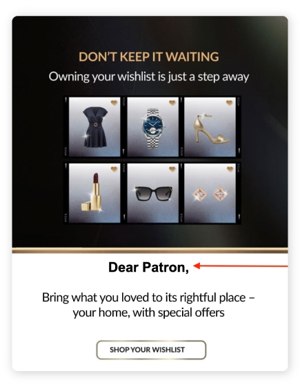
👉Real-life example: Take this wishlist reminder email. The message shows six specific items the customer saved: a dress, a watch, heels, lipstick, sunglasses, earrings—then addresses them as ‘Dear Patron.’
This point is especially critical, because 73% of customers expect better personalization as technology advances.
Amanda Waterstone Carthy, Founder at QueenMee Accessories, figured this out early. "The single best philosophy that has served my brand for successful email marketing has been to keep the brand tone as personal as possible," she says.
Every single email contains a photo of her, and she addresses customers by first name as if she's writing them a personal message. As a fashion accessories brand, she also shows herself wearing the pieces.
Even when she uses model photos for the main image, she includes a photo of herself wearing the product further down the email.
"Customers want to connect with an authentic brand leader, particularly in this age of AI generated images and copy," Amanda says. "They want to know that when they place an order, it makes a difference in supporting a small business like mine."
She’s on to something. 41% of shoppers believe that AI-driven emails make brands feel less authentic, reducing their genuineness and transparency.
👉Real-life example: Take a look at the welcome email Amanda sends to every new subscriber:
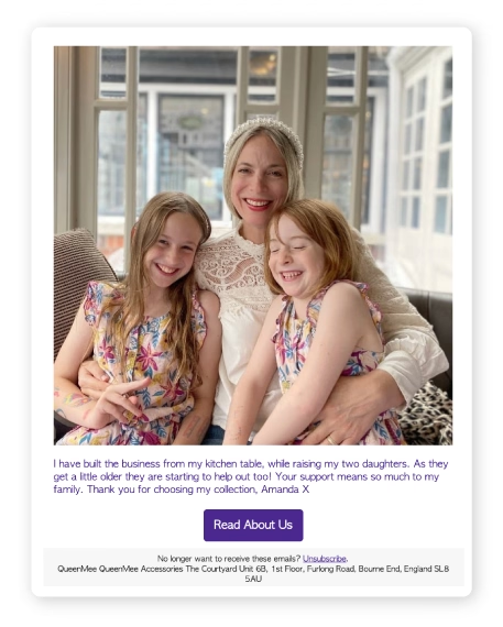
She shows up—literally; with her daughters, from the kitchen table where she built her business.
And it works. Her average open rates for 2025 are running at 68%, with average click rates at 1.73%. When she runs an offer, click rates skyrocket into double digits.
What to do instead:
1. Pull language from real experiences.
Look at support tickets, reviews, survey responses, and chat logs.
What words do your customers actually use? What problems do they describe? What outcomes do they want? Try to use that exact language in your emails, because when someone sees their own words reflected back at them, it clicks.
Instead of:
‘New collection just dropped. Shop now.’
Try:
‘Remember that knit you loved last year but missed? It’s back!’
2. Use the 3:1 “you-to-I” ratio.
In Denny Hatch's book Method Marketing, he recounts advice from his boss early in his career, who shared a list from humorist Goodman Ace of the 12 most powerful words in direct mail:
‘you, save, money, easy, guarantee, health, proven, safety, discovery, new, love, results.’
Notice what's on that list—concrete benefits.
‘You’ instead of ‘our valued customers,’ ‘save money’ instead of ‘optimize your expenditures,’ and ‘proven results’ instead of ‘leveraging synergistic solutions.’
These words work because they speak to what people actually care about in the language they actually use.
So, instead of:
‘We launched a new collection we’re really proud of.’
Try:
‘You’ll love the feel of this new collection, perfectly warm for your chilly mornings.’
💡Pro tip: Sean Flannigan, Senior Editor at The Retail Exec, advises to “speak your emails out loud,” because what's in your head is not always what it actually sounds like in reality.
3. Make your sender information feel human.
Use a real person's name and email address as your sender.
Instead of ‘noreply@company.com’ or ‘marketing@company.com,’ send from ‘amanda@queenmee.com’ or ‘sarah@yourcompany.com.’
Even better, make it a real reply-to address that someone actually monitors. When customers hit reply and get a response from a human, you've just turned an email into a conversation.
4. Use merge tags for more than just names.
Personalization tokens (also called merge tags or dynamic fields) let you reference location, wishlist items, past purchases, loyalty status, and more—not just ‘Hi [First Name].’
Instead of:
‘We thought you might like this.’
Try:
‘That velvet bag you saved last week is still available (and it’s 10% off today!)’
Email marketing mistake #8: Ignoring mobile and accessibility standards
Most of your emails are opened on phones, so if they don't work on mobile, they don't work.
Research shows that while mobile accounts for 27% of opens, it only drives 18% of clicks—a sign that readers are getting your message but not taking action.
This is because according to Litmus’ 2025 The State of Email report, email design isn’t keeping up with mobile or accessibility needs:
- Only 47% of marketers use even basic accessibility best practices like adding alt text to images.
- And 47% still rely on manual rendering tests across devices and email clients, which miss tons of browser/mobile combinations and are prone to human error.
That means more than half of brands are sending emails that people with visual impairments, screen readers, or assistive technologies simply can't use.
👉Real-life example: Here’s how not to do mobile email marketing.
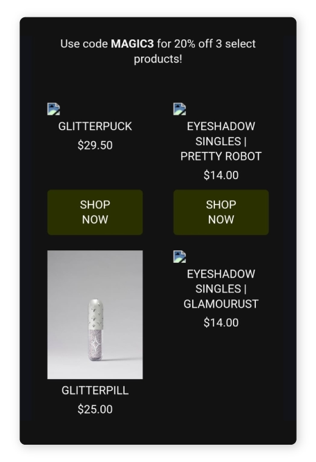
- The images are broken: Three out of four product images don’t load, likely due to missing alt text or improperly hosted files.
- The grid layout is cramped on mobile: Two-column designs that aren’t responsive get squeezed, making it hard to tap buttons or read pricing.
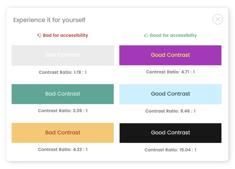
- The button contrast is poor: The dark green CTA on a black background lacks visibility and fails WCAG accessibility checks.
🧠 Quick note: WCAG stands for Web Content Accessibility Guidelines—a set of international standards that help ensure web content is accessible to all users, including those with visual impairments.
Now compare the example above to this one below:
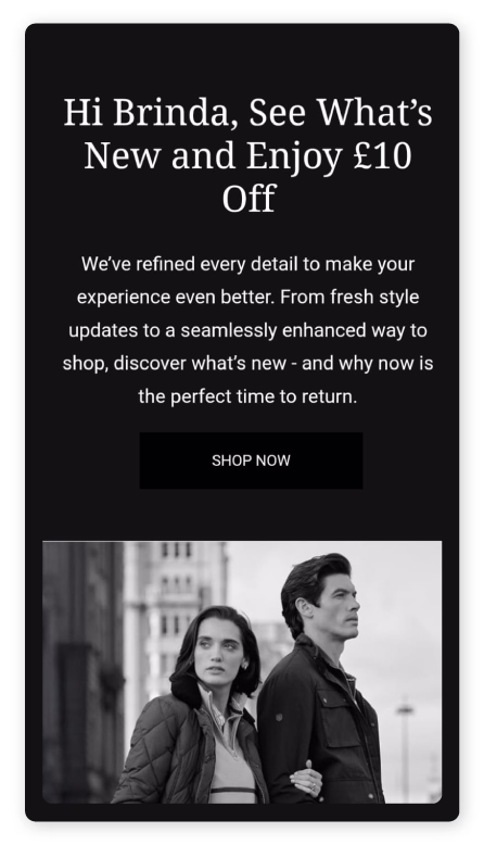
- There’s a personalised greeting: The above-the-fold says ‘Hi Brinda,’ which instantly grabs attention and creates connection.
- There’s a clear, single-column layout: Easy to scroll, read, and tap.
- There’s text that’s large and readable: Body copy is at least 16px, with solid contrast.
- There’s hierarchy and whitespace: There’s room to breathe. The bold offer (‘£10 Off’) is up top, followed by an easy-to-read body, CTA, and image.
The difference between mobile-optimized and mobile-hostile is obvious when you see it side by side.
What to do instead:
1. Use tappable targets of at least 44×44 points.
- Apple’s Human Interface Guidelines recommends interactive controls (buttons, links) be at least 44×44 pt so users can accurately tap them with their finger.
- On Android, the guideline is often 48×48 dp.
This aligns with WCAG 2.5.5, which calls for minimum target sizes to improve usability, especially for people with less precise motor control.
2. Design for one-thumb use.
Steven Hoober’s mobile usability research introduced the concept of the ‘Thumb Zone’: the area of a smartphone screen that’s most comfortably reached with one thumb during one-handed use. And with phones getting larger, this principle matters more than ever.
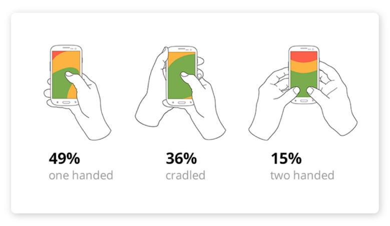
- Place key actions (like CTA buttons) near the bottom of the screen or email, where thumbs naturally hover.
- Avoid stacking links too close to the top of your email header or navigation because users might struggle to tap them without adjusting their grip.
- Design vertically—use a single column and keep the tap targets comfortably spaced in the natural arc of the thumb.
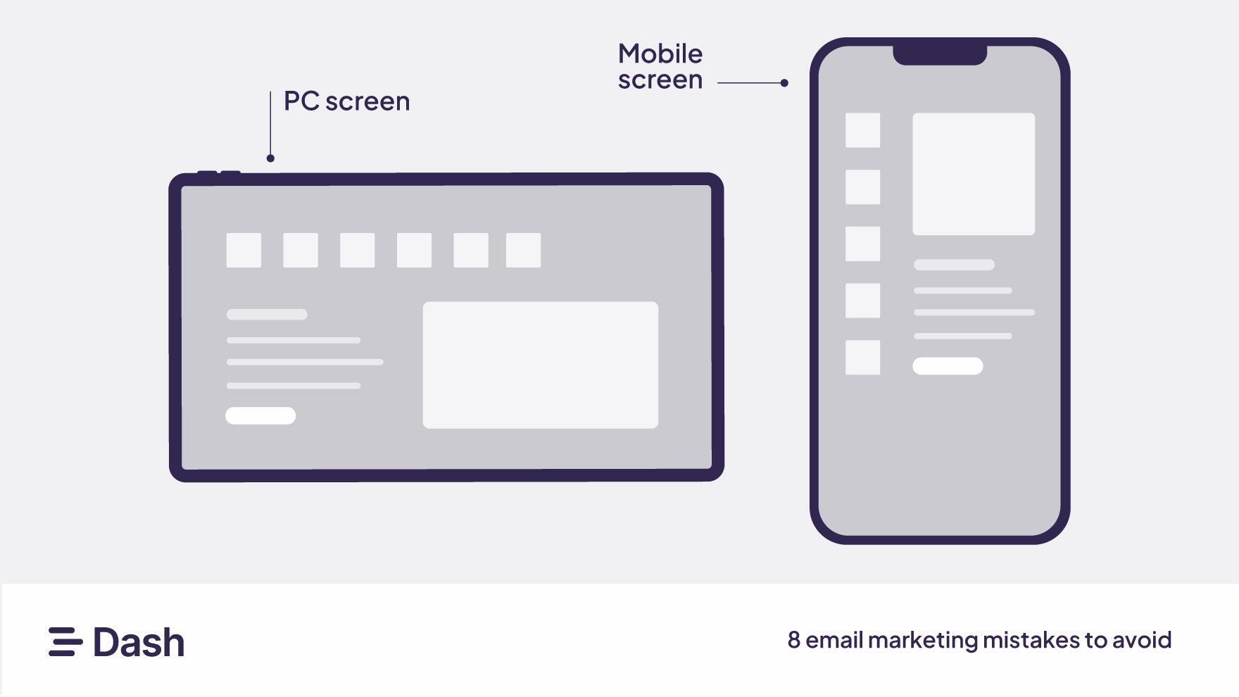
3. Design layouts that respond.
Apple’s guidelines emphasize creating layouts that fit the screen on any device without any horizontal scrolling or zooming.
Use responsive or fluid layouts so content reorganizes naturally for narrow screens (one column, stackable modules).
4. Provide alt text and accessible labels.
Many mobile email clients block images by default, so always supply alt text for images so the message still ‘reads’ without the visual.
For icons or image-based buttons, include descriptive labels so screen readers and assistive technologies know what they do.
Add descriptive alt text like this:
🖼️ alt=’Lavender velvet crossbody bag with gold chain strap’
Not like this:
alt=’image123.jpg’
This makes sure your message still lands, even if the image doesn’t.
5. Use readable font sizes and support dynamic text.
Apple recommends body text be at least 11 pt so text is legible without zooming.
Also support Dynamic Type (iOS) or font scaling, so users who’ve opted for larger text sizes see your emails clearly.
6. Check color contrast and text size.
Light gray text on white background might look sleek on your designer's monitor, but it's unreadable on a phone in sunlight—and impossible for people with visual impairments.
Use sufficient color contrast (at least 4.5:1 ratio) and readable text sizes.
7. Write for how people read on mobile.
Mobile screens limit how much text people see at a glance, especially in subject lines and preview snippets. That means you need to front-load your value, skip the fluff, and break up long blocks of text into digestible bites.
- Aim for subject lines under 40 characters, and get your point across fast.
- Assume readers will scroll with their thumb in 1–2 seconds per section. Use headlines, icons, emojis, and spacing to guide the eye.
- Use short sentences and bullet points to make your copy skimmable.
Subject line (≤ 40 characters):
‘The velvet bag is back 👀’
Preview Text (≤ 90 characters):
‘You saved it. It’s back in stock—10% off today only.’
8. Don’t ignore dark mode.
An average of 35% of email opens used Dark Mode in 2022, representing steady year-over-year adoption and reinforcing the need to design with both light and dark themes in mind.
- Use transparent PNGs instead of flat white backgrounds to allow the image to adapt.
- Avoid black text on transparent images—it will disappear in Dark Mode.
- Add outlines or shadows to logos and icons that may fade into dark backgrounds.
- Use system fonts (like Arial or Helvetica) when possible—they render more predictably across light and dark themes.
- Test your emails in both Light and Dark Mode across devices using tools like Litmus or Email on Acid.
How to start sending better emails today
Now that you’ve seen the most common email marketing mistakes, let’s make sure you don’t repeat them.
Use this quick checklist to sense-check every promotion and newsletter you send, from visuals to voice to value.
[fs-toc-omit] Step 1: Audit your current email program
Goal: Understand what you are currently sending and how it performs.
- Categorise sends: Calculate the percentage of emails sent as one-time campaigns (e.g., promotional newsletters) versus lifecycle/automated sends (e.g., welcome series, abandoned cart). Target a higher proportion of automated sends.
- Review key metrics: Document the average open rate, click-through rate, and conversion rate for your top five campaigns and your top three automated emails.
- Identify ‘spammy’ triggers: Pinpoint any emails that are purely promotional, sent too frequently, or have a high unsubscribe rate.
[fs-toc-omit] Step 2: Build and optimise core automated flows
Goal: Establish the fundamental flows that provide value and drive consistent revenue.
Prioritize 3-4 core flows: Immediately build or optimise your most critical automated flows, such as:
- Welcome series
- Abandoned cart
- Post-purchase/onboarding
- Winback/re-engagement
Define success metrics: Set a specific conversion goal for each automated flow (e.g., a 20% conversion rate for the abandoned cart flow).
Map the customer journey: Make sure these flows are triggered by customer behaviour, not just a calendar date, making them highly relevant.
[fs-toc-omit] Step 3: Implement brand consistency and testing
Goal: Create a professional, cohesive experience and establish a culture of continuous improvement.
- Standardise brand voice: Create a short guide outlining the required tone, level of formality, and key messaging pillars. Ensure all emails (campaigns and automated) adhere to it.
- Enforce visual cohesion: Finalise a single, professional template for all emails. Ensure consistent logo usage, button styling, color palette, and font choice.
- Schedule your first test: Choose one element (e.g., a new subject line for the welcome series) and launch an A/B test this week.
- Document and apply your learnings: Create a simple log for all test results and immediately apply the winning variation to the live email.
[fs-toc-omit] Step 4: Organise and optimise your creative assets
Goal: Save time, repurpose high-performing content, and fuel faster testing with a searchable creative library.
- Track performance by asset: Experiment with different email banners, product images, or UGC blocks—and then record how those assets perform. Tag creatives in Dash by campaign name, asset type, or performance metrics so you can find your top-converting visuals in seconds.
- Let AI handle the tagging: Dash’s Smart Tagging uses AI trained on your existing metadata to suggest accurate tags, like product category, collection, or season, during upload or bulk edits.
- Create custom fields that match how you work: Whether you sort by product SKU, collection, influencer, season, or shoot date, Dash makes it easy to search by what actually matters. Dash’s AI Search lets you use natural language to find images, even if they haven’t been meticulously tagged.
- Fuel future sends faster: Google Drive, who? With Dash, you’re always a few clicks away from your most effective, brand-approved visuals.
Stop wasting time searching for yesterday's assets. Move faster with Dash.
Email marketing mistakes FAQs
[fs-toc-omit] What is the 80/20 rule in email marketing?
The 80/20 rule means 80% of your emails should provide value: education, entertainment, or insights. And no more than 20% should be directly promotional.
This isn’t a rule set in stone, but it keeps your audience engaged without burning them out on constant sales pitches.
[fs-toc-omit] What is the 60/40 rule in email?
The 60/40 rule usually refers to email design balance: 60% visuals, 40% text. The balance helps your message look clean and load fast while staying readable across devices and avoiding spam filters triggered by image-heavy layouts.
[fs-toc-omit] What are the 10 rules of email etiquette?
These aren’t hard-and-fast rules, but solid guardrails to keep your emails clear, respectful, and professional:
- Use clear, relevant subject lines.
- Keep your message concise—say what matters, skip what doesn’t.
- Avoid all caps (no one likes to be yelled at).
- Personalise thoughtfully, not creepily.
- Proofread: typos and broken links kill credibility.
- Add alt text for images so your emails stay accessible.
- Optimise for mobile because most people open on their phone first.
- Honour unsubscribes immediately.
- Respect frequency; don’t crowd the inbox.
- Always include a visible contact or reply option.
They’re guidelines, not gospel. But follow them, and your emails will sound more like a person and less like a marketing machine.
.avif)
Brinda Gulati is a fractional content marketer and former thrift store owner who writes, reads, and speaks commerce and SaaS. She has two degrees in Creative Writing from the University of Warwick, and believes that above all, stories are a deeply human endeavour.