Walk down any supermarket aisle and you’ll see it: the soft drinks category has had a serious glow-up. Where it used to be all Sprite, Pepsi and Cola, you’ll now find CBD-infused drinks, kombucha and fancy water companies stealing the spotlight.
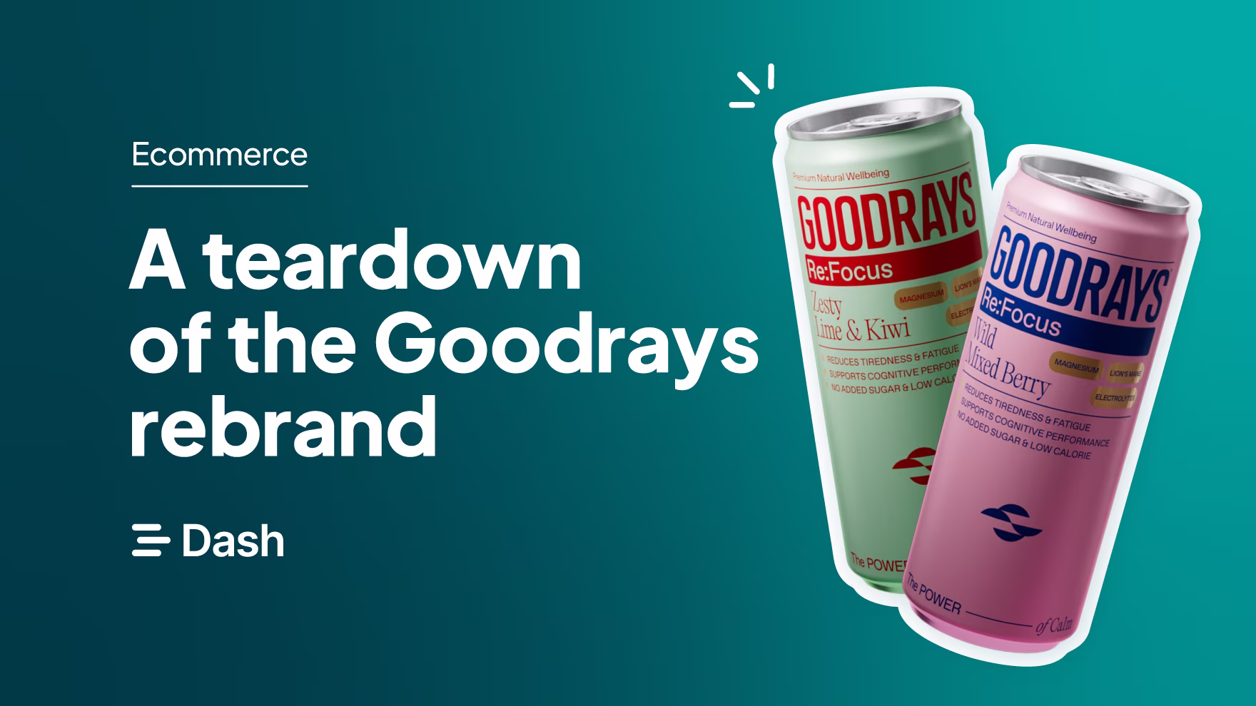
One of these brands is Goodrays, a CBD drinks brand. They’ve grown rapidly, quickly moving from direct-to-consumer to being stocked in major UK supermarkets. Their growth has sparked an exciting rebrand, and as they’re a Dash customer, we’ve been following their journey closely.
As a graphic designer, I’m always fascinated by how brands like Goodrays use design to stand out in crowded spaces. So in this article, I’ll be diving into their rebrand to explore how they’re able cut through the noise and make their mark in a crowded market.
Who are Goodrays?
Goodrays launched in 2020, which was a challenging time for any new brand. But they tapped into something people really needed: calm, clarity, and a moment to breathe. 🧘
Their products include CBD-infused sparkling drinks, gummies and oils to help you reset and feel calmer. They’re a refreshing alternative to traditional soft drinks or alcohol. We’ve even got a stash in the Dash office for when the afternoon calls for something a little more mellow.
They’ve been using Dash for years and it's been amazing to see them now being stocked in major stores like Waitrose, Tesco, Sainsburys and Selfridges.
👉Check out how Goodrays are managing their brand assets in Dash 👈
What did Goodrays look like before the rebrand?
Before the rebrand, Goodrays had a look that fit right in with the CBD drinks scene. Their pastel colour palette and use of gradients were on trend at the time, but as more brands entered the market with similar styles, it became harder to stand out. Here are some points of notes:
- The original logo was simple and typographic — clean, but not especially distinctive.
- The packaging design stretched across the full height of the can, which made it tricky to take in at a glance on busy shelves. This is arguably not so important if you’re only selling online, but as soon as a product hits retail shelves, you’re suddenly competing against lots of other brands so it's easier for product information to get lost in the crowd.
👉 Check out Jo Densely’s article on creating product packaging that will stand out.
- And the website followed a similar style. It was functional and straightforward but didn’t fully capture the calm, premium feel of the brand or the quality of the product.
How each element of the redesign has elevated Goodrays’ brand
In August 2025, Goodrays had a serious glow-up. ✨ Here are some key elements that have changed - and why I love them.
Overall brand identity
Goodrays’ rebrand now reflects their vision to evoke ‘the feeling of calm’. Every part of the new design — from the colour palette to the typography — feels intentional and premium. The visual identity now matches the quality of what’s inside the can, which naturally builds more trust with customers. It’s clean, confident and grown-up, showing how far the brand has come since its early days. The update also gives them a stronger, more elevated look that helps them stand out in the fast-growing CBD drinks market.
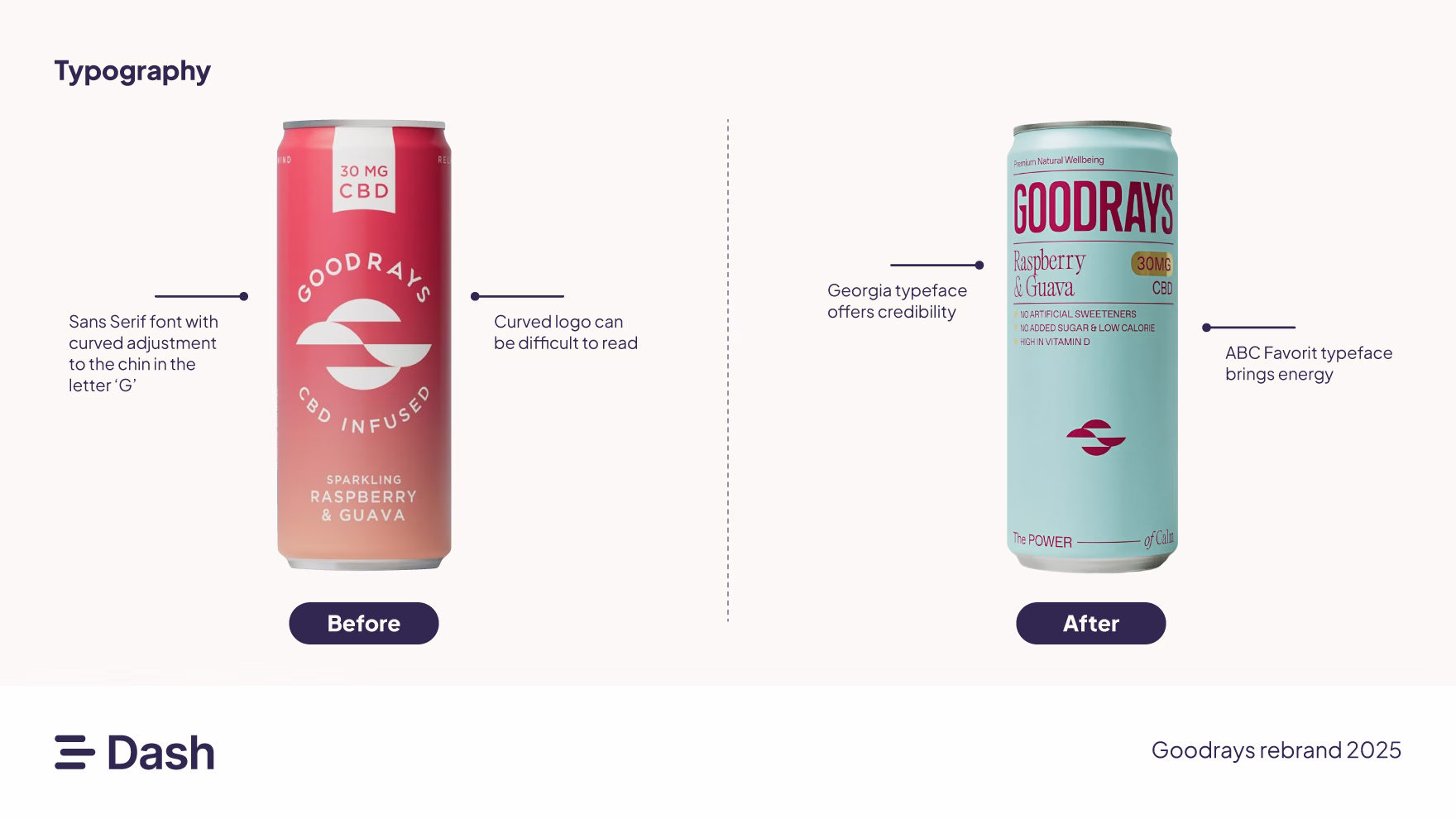
Fonts
I love fonts! But, let's be honest, most people aren’t consciously thinking about the different fonts they see smiling out at them from the supermarket shelves.
But subconsciously, it makes a big difference.
Before their rebrand, it looks like Goodrays used a sans serif font which had been tweaked slightly on the ‘G’ and ‘S’. However, these custom edits weren’t strong enough to differentiate them from another brand’s logo using the same font.
But take a look at it now! They’ve paired Georgia, a classic serif that feels trusted and established, with ABC Favorit, a clean sans serif that’s playful and modern. Each font has a clear role: Georgia brings credibility and ABC Favorit adds energy. Together, they strike the right balance which is calm, confident, and easy to trust.
Packaging
Next, let’s look at the new Goodrays packaging.

They’ve ditched the gradients and instead their colour palette leans into ‘wellness’. They’re using soft neutrals, muted pastels and cool tones that feel calm and balanced. These shades are often used in health and supplement branding because they signal purity, quality and care.
There’s plenty of white space too, which adds a minimal, almost ‘clinical’ touch — the kind of design you’d expect from a wellness brand rather than a typical fizzy drink.
Finally, all the key info sits at the top of the can, so retail shoppers can spot it fast. It’s designed for quick grabs and instant brand recognition. The layout flows naturally from top to bottom, with the logo taking prime position. You see Goodrays first, which is exactly as it should be.
Logo
The old logo leaned heavily on its icon — it was the main focal point, even more so than the brand name. But that focus didn’t necessarily serve the consumer. The iconography wasn’t immediately clear; you only understood the sunrise/sunset reference after reading the name. Plus, curving the type made legibility a bit tricky.
The new logo, though, feels like a breath of fresh air. I love it — it’s got so much more personality 😍. It still nods to the original (the curve on the arm of the ‘G’ is a nice touch), but now it feels bolder and more confident.
A few other details worth noting:
The curved crossbar on the ‘R’ subtly hints at a sunrise, tying neatly back to the name Goodrays.
It’s a wordmark-only logo, which works perfectly for short, distinctive brand names.
The condensed font saves horizontal space without losing impact.
Here are some other areas to note:
- The curved crossbar on the ‘R’ hints at a sunrise, tying neatly back to the name Goodrays.
- It’s a wordmark-only logo, which works perfectly for short, distinctive brand names.
- The condensed font saves space without losing impact.
- It even has a subtle retro feel, which is a little nod to old-school wellness branding, but in a fresh, modern way.
Why thoughtful rebranding matters for ecommerce brands
As a designer, I love seeing brands evolve in a way that feels true to their purpose. Goodrays’ rebrand isn’t flashy or trend-driven — it’s thoughtful, calm and confident. It takes everything that made the brand strong and refines it to match where they are today.
It’s proof that design can do more than make something look good — it can tell a story, build trust, and make people feel something. The new look gives Goodrays a stronger shelf presence and a sense of credibility that really sets it apart. I actually bought Goodrays before the rebrand because of the flavours and the 30mg of CBD, but it didn’t exactly stand out against competitors. Now, with this new look, I’d feel even more brand loyal — it just fits.
If you’re currently thinking about a rebrand, I’d recommend checking out a couple of our articles to get inspired:
And if you’re in the thick of managing new brand assets, make sure they’re properly organised. You don’t want to be digging through shared drives or email threads trying to find your latest designs. Instead, use a digital asset management tool like Dash to manage, organise, feedback on and share your assets easily. You can grab a 14-day free trial or book a demo with our team.
Lucy is the Marketing Designer behind Dash’s brand. She knows a thing or two about ecommerce brands, and how to appeal to them. She writes about branding, design and scroll-stopping visuals.