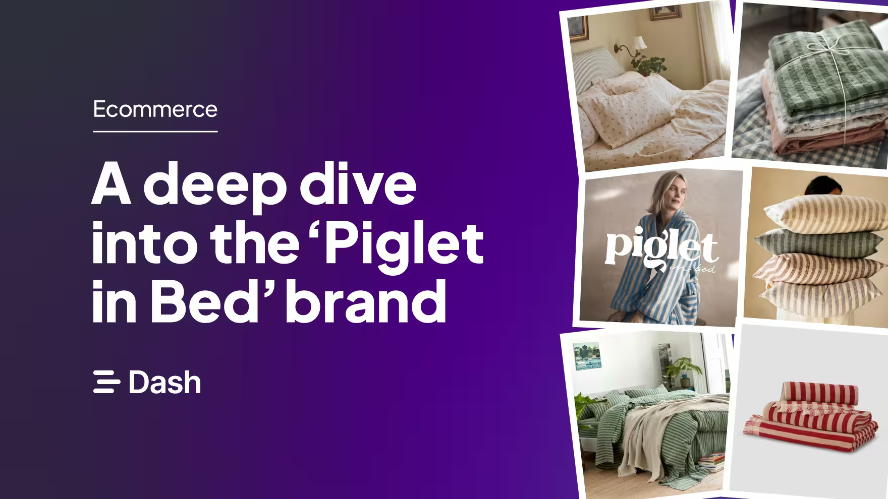
Look through the socials of most homeware brands and you’ll see plenty of beautiful products. So it's understandable that marketing teams are working hard to create branding that really stands out.
That includes the UK homeware brand, Piglet in Bed. As a graphic designer, I’m always on the lookout for brands that are excelling at their branding. Good creative goes a long way to help capture the attention of audiences and bring in new customers. And for Piglet in Bed, they nail a particularly aesthetic that I can’t get enough of.
In this article, I’ll break down what homeware brands can learn from Piglet in Bed’s branding. We’ll look at design choices that build trust, along with smaller details that make an ecommerce experience feel thoughtful and memorable.
Who are Piglet in Bed?
Piglet in Bed is a UK-based homeware brand creating luxury linen bedding inspired by the English countryside. Founded in 2017, the brand has grown from a DTC bedding business into a well-known homeware name. They’ve expanded into the physical retail space and built a TikTok community of 172k + followers strong.
Their brand is rooted in comfort, craftsmanship, and everyday moments. Whenever I see Piglet in Bed’s branding, I feel like I’m in a small, cosy reading room in a farmhouse. It feels like a comfortable armchair by the window, looking out over the fields, with a cup of tea and a good book in hand.
For homeware brands, Piglet in Bed is a strong example of how a clearly defined brand can scale without losing its identity.
Why each element of Piglet in Bed’s branding just works
As a designer, I’m focused on the visual branding of Piglet in Bed, but you can check out our podcast episode with Rhiannon, Head of Brand, who digs into the goals and strategy they use to reach new audiences.
🎧 Listen on Spotify
🎧 Listen on Apple Podcasts
Now, let’s get into aesthetics. ✨
Overall brand identity
A brand identity is only as strong as how it shows up in the real world. For Piglet in Bed, the visual language established through colour, typography and illustration doesn't stop at the logo — it carries through every touchpoint a customer encounters.
Logo
Let’s start here: the Piglet in Bed logo is splendid.
%20(2).avif)
The ear and descender of the letter ‘g’ resemble a pig’s tail — what a joy! Combining this with handwritten-style typography gives the logo a handmade feel, which leans into the brand’s vision of artistry and passion.
Colours
The Piglet in bed pattern design used on their products is whimsical, wholesome and delicate so they needed a brand identity to reflect the narrative.
The brand consists of:
1) Dark grey - symbolising elegance, balance, luxury and timelessness
2) Dusty teal - symbolising life, growth, nature and harmony and
3) Rosy blush - hinting at rosey cheeks representing life, peace and warmth.
4) Marble blue - communication, intuition and inner peace
Together, these colourways and white space create a balanced and calming feel across the website, allowing the colours and patterns in the products to breathe and never feel overbearing.
The colour palette also creates individual identity for the Piglet in Bed stores with Tunbridge Wells focusing on the Rosy Blush, Bath the Dusty Teal and Harrogate the marble blue creating their own distinctive personalities.
.avif)
Typography
Typography plays a key role in Piglet in Bed’s visual system.
The website uses Bastia for headings and product titles. Bastia is a modern serif font that gives the brand a touch of class — it feels trusted, traditional, and clean to read.
Bastia is paired with Commissioner, a clean sans serif typeface. Combining serif and sans serif fonts creates contrast, hierarchy, and clear separation, establishing distinct roles:
- Serif for headings and subheadings
- Sans serif for details, longer paragraphs, and buttons
.avif)
Plus, handmade style illustrations make the brand feel human, authentic and approachable. The style of illustration also offers a unique touch and journey, which differentiates from other brands in the same field. In the digital age, most icons will be perfectly stylised so offering a more handmade custom style builds personality and tone of voice.
.avif)
Website
The Piglet in Bed website is clean and uncluttered, with plenty of breathing room around the products. This gives users space to digest the content without feeling overwhelmed.
One section that stood out is the 'Piglet at home' carousel on the homepage, which features real community homes rather than polished product shoots — a much more human touch.
%20(5).avif)
Small interactions reinforce the brand too. Hovering over a product flips the image to a second view, letting shoppers gather information without leaving the page. These small moments make browsing feel effortless and help build brand loyalty.
Social media
Social media feed is authentic and echoes the Piglet in Bed brand with the use of real-life, personal scenarios such as ‘bedding inspo’ in a cottage setting - showing products in spaces full of character celebrating individuality and made for living. Users get to imagine the products in real-life settings.
%20(3).avif)
Why thoughtful branding matters for homeware brands
Piglet in Bed is a great example of how strong branding doesn’t have to be loud or trend-led to be effective. Every design choice works together to create a considered ecommerce experience. Nothing feels accidental. And that’s exactly why the brand resonates so strongly with its audience.
If you’re currently thinking about refining your brand — whether that’s a full rebrand or small design improvements — it’s worth taking a step back and looking at how consistent your visual assets really are across channels.
And if you’re managing growing libraries of product photography, lifestyle imagery, and design files, keeping everything organised is just as important as creating great visuals in the first place.
A digital asset management tool like Dash helps ecommerce teams store, organise, share, and update brand assets without the usual chaos. You can start a 14-day free trial or book a demo with our team.

Lucy is the Marketing Designer behind Dash’s brand. She knows a thing or two about ecommerce brands, and how to appeal to them. She writes about branding, design and scroll-stopping visuals.